“What kind of airline do you aspire to be?” This is the first question that airline managers are asked by Edmond Huot when they meet.
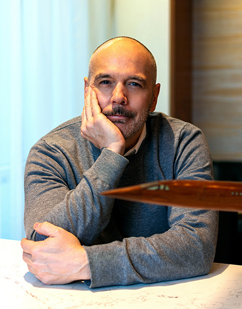
Canada-born Huot is an airline livery designer (yes, such a job exists!) at Forward Media, a creative design studio based in New York City.
To be exact, his work encompasses far more than the livery. He works mostly with startup airlines in the definition and development of their brand identity. That includes the livery, but also the many different touch points across the travelers’ journey, from the carrier’s digital channels to the look of the crew’s uniforms.
In conversation with AeroTime, Huot dissected the creative process that he has followed to create or revamp several airline brands.
“The first phase is always about listening and learning,” Huot explained. “Customers are often eager to see something, some results, but it is important to tick all the boxes before moving onto the creative stage. If you try to unleash your creative impulses too soon, it’s easy to miss the fundamentals of the client’s business.”
This is followed by deep analytical work. Huot likes to create ‘personas’ representing the different types of passengers, give them an identity and try to think what they are looking for when traveling.
It is only when Huot and his team are satisfied with the previous steps that they get to sketching. Time to get the creative juices flowing!
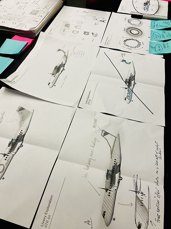
“I like to look at the past as a source of inspiration. In particular, I am fascinated by the airline brands of the 1960s, the likes of Braniff and TWA,” Huot said. “There is something truly iconic in them that we try to capture and re-interpret in a fresh, novel way.”
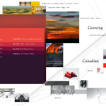
The next step is to present the initial mood boards based on gathered learnings to gather feedback and make changes, if necessary, “if the client engages in the process wholeheartedly, everything becomes much easier, and the results tend to be much better,” Huot explained.
It is a staged process that takes place within the customer journey framework, from the pre-departure stage (with the digital assets and channels of the airline taking center stage) all the way to post-arrival (with elements such as the loyalty program carrying on the engagement with passengers over long periods of time). And, of course, everything in-between, from the check-in process and the interaction with ground staff, to the visual elements on the outside and inside of the aircraft.
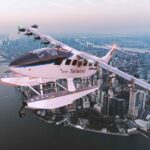
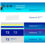
A case in point is that of New York charter company Tailwind Air. This seaplane operator caters to a niche and somewhat sophisticated market. It offers a scheduled seaplane service connecting Manhattan (the seaplanes operate from the East River) and downtown Boston to Washington DC and several smaller coastal towns along the eastern seaboard.
In this case, an established airline wished to relaunch its corporate identity in tandem with its expansion into new markets and its ambitious plans to adopt new flight technologies, such as electric aircraft and eVTOLs, in the near future.
Again, Huot’s team looked at the historical precedents.
This being a seaplane operation, the designers dug into the Pan Am Clipper era in the 1930s, and the imagery it evoked. They also looked at the Concorde and how it was marketed as a way for affluent yet time-poor travelers to maximize their schedules while enjoying a truly unique experience incomparable to that of mainstream airlines.
This project involved not just coming up with the visual elements that defined the new brand identity of the carrier, but also a rethinking of the passenger experience at the shore terminals. These went from being little more than nondescript sheds to having a look and feel that is now aligned with the brand attributes of exclusivity and convenience.
There is, of course, a strong emotional component to this.
“We want to evoke a feeling, capture a certain essence of what the brand stands for and how it relates to the environment and communities it serves,” Huot elaborated.
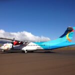
For example, the concept for Island Air’s livery was inspired by both botanical motifs such as the Hawaiian Lei as well as the intense and vivid colors evocative of both the islands’ volcanic activity and the surrounding seascape’s hues of aqua greens and blues.
By way of contrast, in coming up with an identity for Northern Pacific Airways, a startup airline based in Alaska, Huot opted for a palette of white, black and grey colors that are reminiscent of the Arctic landscapes and include some references to the native peoples of the region.
The northern landscapes were also a central theme in another of Huot’s airline brand projects: a newly proposed carrier called Maple. This was a project initiated by a Canadian regional carrier, which had been contemplating going national immediately prior to the pandemic.
In that instance, winter white landscapes, along with the vivid orange and red of the prairie sunsets, also formed the tonal backdrop for the brand’s master color palette. Another graphic element that helped make up the design vocabulary for that airline brand concept was the elegant pattern of triangular icons, inspired from the flocking formation of Canada geese. The different tones of red and white used throughout the livery were a clear reference to the carrier’s nationality.
The livery is perhaps the most prominent element when it comes to airline branding.
Liveries come in all styles and colors, and one may even think of it as an artistic genre in its own right.
Few people know more about airline liveries than Guilhem Renier, author of “Airline Liveries Overview 2023”, a comprehensive study of the airline livery scene.
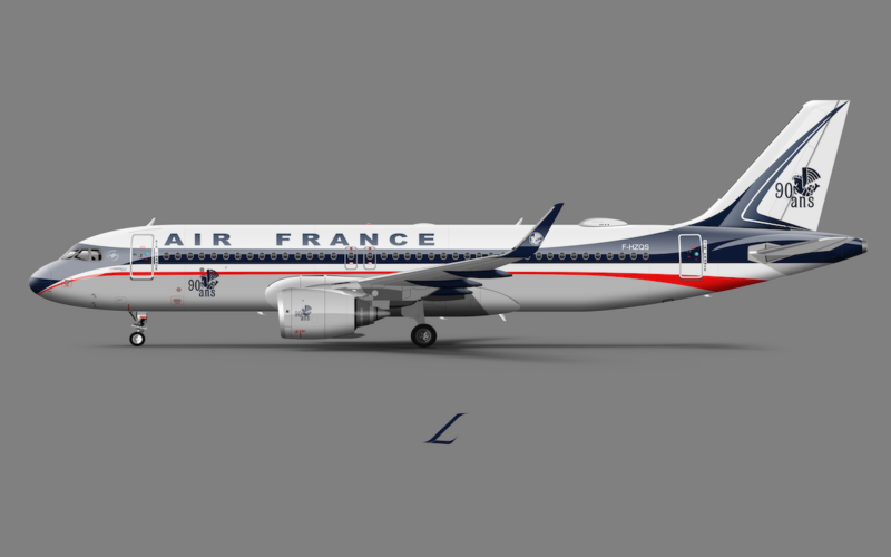
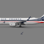
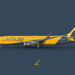
Renier is also the mind behind La Livery, a website and Twitter account where he showcases some of his ideas about livery design, including some creative reinterpretations of well-known airline liveries and brands.
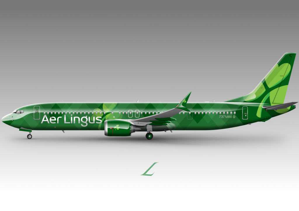
“The livery is the main element that allows one airline to differentiate itself from another. It is a kind of giant ad billboard, through which the airline tries to convey several messages through visual codes,” Renier told AeroTime “At a glance, the livery must convey certain information to customers: is the airline serious, punctual, inexpensive, reliable, premium, modern? Depending on how the livery looks, you can confirm or rule out certain of these elements. And since it is seen by millions of people in airports or on media platforms, the message conveyed must be clear enough.”
Nevertheless, Renier believes that as yet not all airlines fully understand this.
“I am not certain that airlines take their liveries fully into account when designing the overall customer experience,” he said. “The cabin design is disconnected from the liveries. However, there begins to be some interaction between liveries and passengers, for example with messages or images applied to the interior surfaces of winglets or engine nacelles, so that passengers can see them from the cabin. This also allows for indirect advertising on social media platforms like Instagram through photos taken from the windows.”
He added: “There are also more and more messages inscribed around the cabin access doors, so that passengers can read them when entering the plane. This is a significant element, as it is at the somewhat ‘critical’ moment when the passengers board that they will read this message.”
Two cases stand out when it comes to endeavoring to align interior and exterior design: The first is Brussels Airlines, with its ‘Belgian Icons’ series. This was a special livery series depicting elements of Belgian culture, such as the worlds of comic hero Tintin, the Smurfs or artists René Magritte and Pieter Brueghel. In addition to the eye-catching livery on the fuselage, the cabin was also decorated with the corresponding themes.
The second case is Icelandair, which did something similar with its own special liveries. The ‘Vatnajökull’ and ‘Hekla Aurora’ liveries take inspiration from Icelandic nature, but they also have an accompanying cabin lighting setup that is reminiscent of the Nordic lights.
In addition to these unique special liveries, the Icelandic flag carrier went through a major rebranding in 2022 that saw it adopt a palette of bright colors. As well as giving the brand a fresher and younger look, the new livery was designed to make the brand more visible on social media channels, making it more ‘instagrammable’.
In his study, Renier has categorized current liveries into several distinct groups, based on objective criteria such as paint placement, percentage of fuselage coverage, and shapes, among other things. He then ran statistical analysis by type of airline, size, region and fleet type to see which styles were most prevalent in each category.
When it comes to talking about airline livery trends with experts in this field, a particularly contentious point is what to make of the so-called ‘eurowhite’ liveries which have become particularly widespread in recent years. These are one of the simplest airline livery styles, leaving most of the fuselage blank except for the airline name and the logo on the tail.
For example, Edmond Huot, while generally not enthusiastic about the concept, makes one exemption: Finnair. “They left a lot of space blank, but it is done in a very nice way.” he explained. “They leaned into this design trend with a more sophisticated and intentional approach, turning up the volume on aspects of their livery including the nuanced typography and letterforms as well as the utilitarian and stark color scheme. Sometimes less really is more. It is perfectly integrated with the overall brand identity and encapsulates very well the Nordic minimalism that Finnair takes pride in.”
Guilhem Renier has his own theory about the recent spread of eurowhite liveries throughout the industry:
“Most of the time, liveries are provided in a branding package that includes the entire branding of the airline, and it’s clear that the livery is not the priority of the company that created the branding,” he explains. “So, to avoid taking risks, most airlines end up with a clean ‘eurowhite’ livery on which their logo appears clearly. If you want to avoid making mistakes, do what everyone else does.”
When asked which of the latest airline liveries he found most interesting, Renier named the following:
- Brussels Airlines (Belgium)
“Brussels Airlines used to have a livery that had really aged badly – that grey/blue belly, that dark blue tail, with a 3D effect logo -, all the codes of the 90s-2000s that were no longer up to date. But their new livery has refreshed all of this with their large color dots that recall a bit of the Atomium in Brussels, as well as their new, more modern font.”
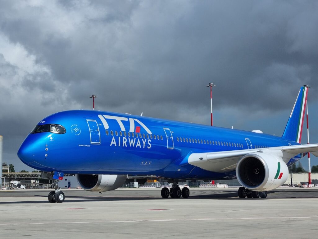
- ITA Airways (Italy)
“I was very skeptical about ITA until I saw the planes in real life, and this blue with ‘mica’ effect. It is particularly beautiful on the tarmac. It attracts attention, and clearly those planes do not go unnoticed. The audacity comes from the use of this glitter paint. However, I am still trying to understand the design of the tail.”
“Condor has the most divisive livery of the moment. I think the move is successful. Condor is a company that often changes its liveries. Their previous one was quite successful and still modern, but this radical choice they have made works rather well.
“Condor is a holiday charter company, so it is not really too affected by ‘design mistakes’. Passengers will not hold it against them as they would if they were a legacy airline, which is probably what allowed them this audacious. And the fact they made this change while receiving their brand-new A330neo has unconsciously attached a ‘modern’ image to this livery. It has generated a lot of talk, a lot of publicity for Condor. So, in my opinion, it is successful.”
How do you keep your brand fresh when consistency is one of your core tenets, though? Take for example VistaJet, a global business aviation company that has made consistency within passenger experience a central element of its identity. Matteo Atti, VistaJet’s Chief Marketing Officer, told AeroTime: “Consistency is the biggest blessing and, at the same time, the biggest difficulty… How do you keep evolving the brand so that it doesn’t become stale, while keeping the consistency of the experience? You need to keep tweaking it slightly so that it stays current.”
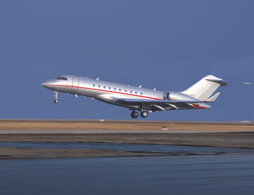
For VistaJet the brand is a holistic experience. It’s not just the livery or the crew uniform – although this matters as well – but every single detail, down to the smell of the cabin. Yes, that’s right: VistaJet makes sure that all cabins across its 360-strong global fleet smell the same. Likewise, the cabin colors and furnishings, even the wine choices and amenities, are consistent across the whole fleet, it doesn’t matter where in the world you board one of their planes.
“It is a sensorial experience. Some of our customers like the fact that the moment they come onboard they already know exactly where to leave their stuff. It’s like a home away from home for them. You build a brand not just through design but with feelings in mind”.
When it comes to keeping the brand up to date, Guilhem Renier also has some advice for the more conservative airlines out there.
“Overall, all airlines that have not changed their livery in at least 10-15 years, with a few exceptions, should start thinking about some modernization, without necessarily going for a complete livery change,” Renier said. “With the increasingly fierce competition between airlines, keeping a livery for too long can unconsciously suggest that the airline is not modernizing, even if in reality they have a modern fleet.”
Renier aims to update his livery report every two to three years, which will make it possible, among other things, to see the evolution of livery styles over time. In the meantime, you can follow Renier and his livery suggestions on La Livery digital channels.

