Logos form a huge part of an airline’s identity, involving meticulous planning and months of preparation.
Carriers will often pay eye-watering sums of money to design agencies or creative studios to find that defining logo that encapsulates the airline’s brand.
While some airlines chose to, understandably, reflect values such as pride, flight and safety through their logos, others see the carrier’s symbol as an opportunity to design something that is innovative and striking.
The pressure to have a logo that “stands-out” means that many airlines choose to push the boundaries further than others and produce design pieces that are ground-breaking.
Some airlines find their individuality by creating logos with hidden meanings or stories, a design that draws in its passenger’s gaze and hopefully becomes the envy of other airlines.
So, here are seven of the most famous airline logos that have a hidden meaning or secret story behind the design.
Jetstar Airways
Australian low-cost carrier Jetstar Airways is a subsidiary of the Qantas Group and was launched in 2003.
Jetstar Airlines is considered to have one of the cleverest logo designs among airlines, simply for the fact that you could spend all day staring at it and still not see why it’s so special.
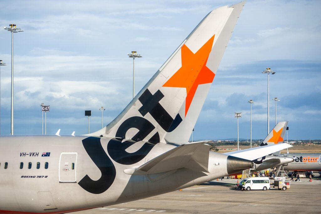
On the airline’s logo to the right of the word ‘Jetstar’ (or sometimes simply ‘Jet’) is an orange five-pointed star.
The star is positioned in such a way that an arrow pointing to the right appears in the space between the last letter and the star.
The arrow is even clearer when it is used on the plane’s tail next to the word ‘Jet’.
The hidden arrow helps to convey Jetstar’s values of progression and forward motion.
Air France
Air France is the national flag carrier of France and is one of the most widely known airlines in the world.
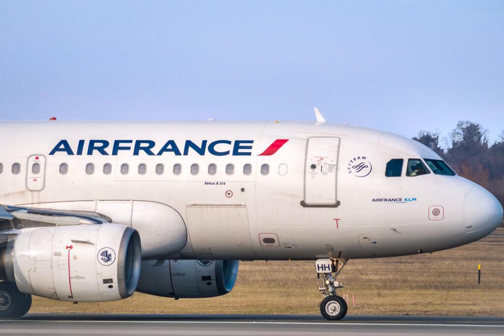
While the use of red, white and blue to reflect the colors of the French flag, or tricolor, is no secret, the symbol after the airline’s name is a bit more confusing.
You would be forgiven for thinking it was just a colorful blob, but it is in fact there to represent a plane taking off and flying away into the sky.
A lesser-known fact is that the engines of Air France’s aircraft bear the airline’s original logo.
This stylized seahorse emblem represents the rich history of Air France, as it was originally used to symbolize both the airliners and seaplanes that the company operated.
Originally, the logo belonged to Air Orient, one of the five airlines that merged to become Air France as we know it today.
Delta Air
The Delta logo is one of the most iconic and interesting airline logos because the meaning behind it is multi-layered.
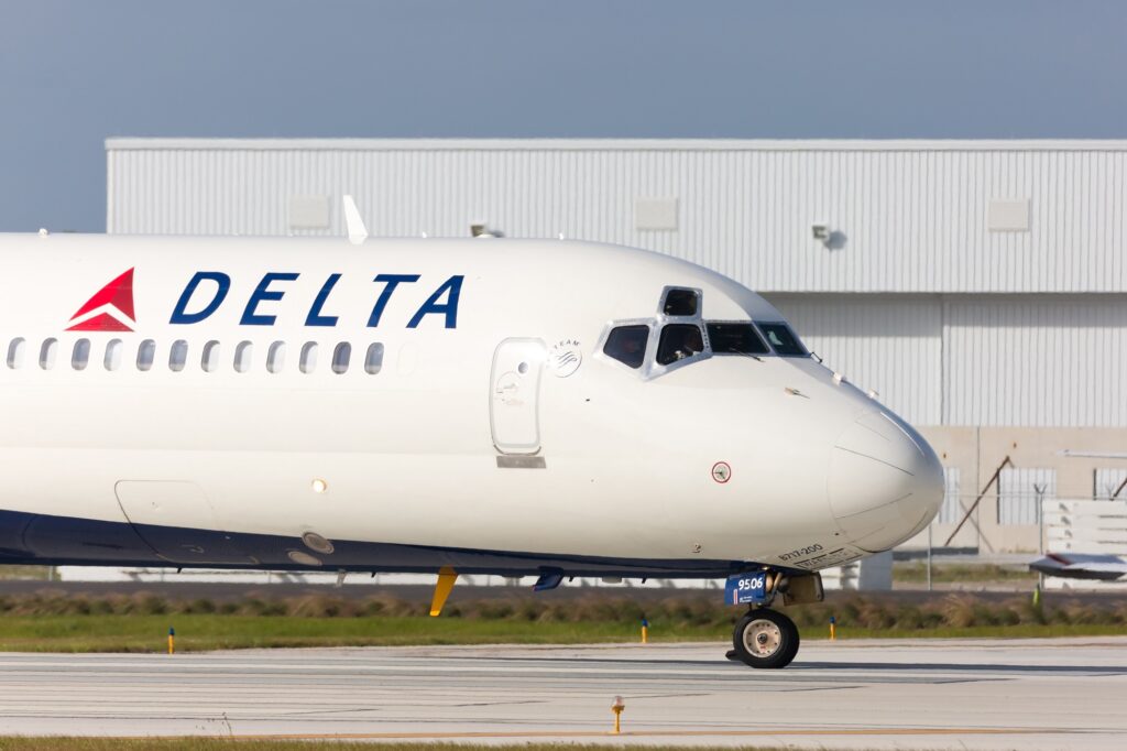
While it is true the name Delta was chosen due to the company’s conception as a crop-dusting business in Mississippi Delta, the actual logo has a number of interpretations.
The famous Delta triangle has actually been used since the 1920s when it was known as the Huff Daland Dusters.
It has also been suggested that the wing shape was split into two smaller triangles to reflect the carrier’s long and short haul flights.
Perhaps the most fitting meaning behind the logo though, is that the triangle looks very similar to the fourth letter in the Greek alphabet, which happens to be called Delta.
Virgin Atlantic
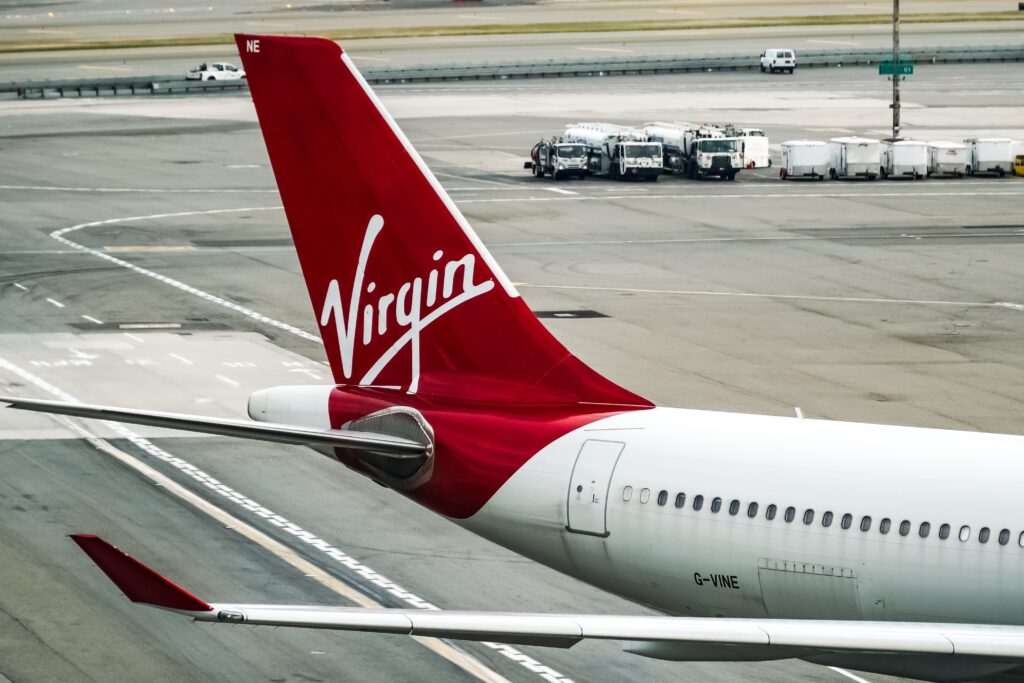
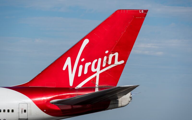
The story behind the much-loved Virgin logo that is seen on the tails of its planes and multiple businesses goes back to the 1970s when the company was starting up in the music business.
According to Virgin, the very first logo was designed by Roger Dean and created with the record label in mind.
The logo was known as ‘Gemini’ and depicted Siamese twins sitting by a tree with a long-tailed dragon at their feet.
However, when the British punk band the Sex Pistols signed for Virgin Records, owner Richard Branson felt the music label needed something edgier to reflect the new music.
A calligrapher called Ray Kyte was signed up and he designed the famous logo that has become synonymous with the Virgin brand today.
Over the following decades it was rumored that the first time Kyte ever drew the Virgin logo was on the back of a napkin, but this has often been reputed as an urban myth.
Transavia
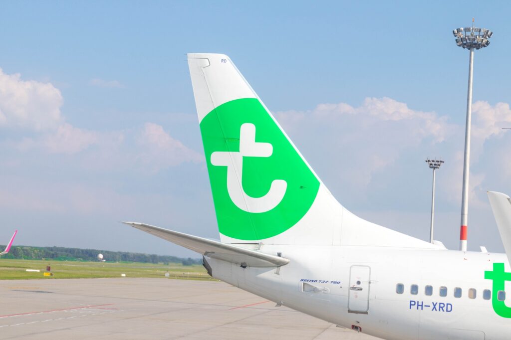
Transavia is a low-cost airline formed in 1966 and now owned by Dutch flag carrier, KLM, which in turn is owned by Air France–KLM.
The airline’s logo is of a green circle with a white ‘t’ in the center.
The letter ‘t’ appears slightly crooked and you could be forgiven for thinking someone had drawn it who maybe wasn’t very good at art.
However, on closer inspection the white ‘t’ is actually formed from two, or even possibly three hearts which help cement the carrier’s tag line, “we make low-cost feel good”.
Northwest Airlines
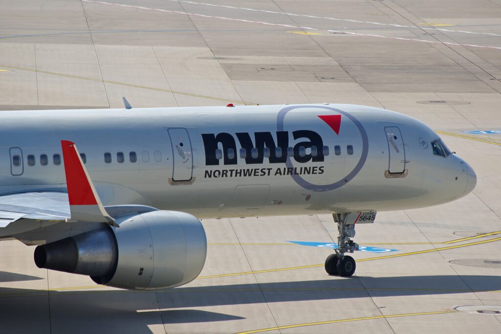
Northwest Airlines was taken over by Delta in 2008 and for five years became the biggest airline in the world.
From 1989 to 2003 the Northwest Airlines logo combined the capital letter from ‘North’ and ‘West’ to feature on the airline’s logo.
While the ‘N’ was easily seen it was much harder to see where the ‘W’ was in the logo.
The ‘W’ only became clear when you realized a small triangle in the top-left of the logo formed part of the lettering.
The design was executed so brilliantly that the small triangle was also used as part of a second image in the logo as a compass pointing in the direction of northwest.
In 2003 the logo was changed to “nwa”, thus removing the illusion of the previous lettering used between 1989 and 2003.
However, in a nod to the previous logo the airline decided to keep the small triangle in place.
Ryanair
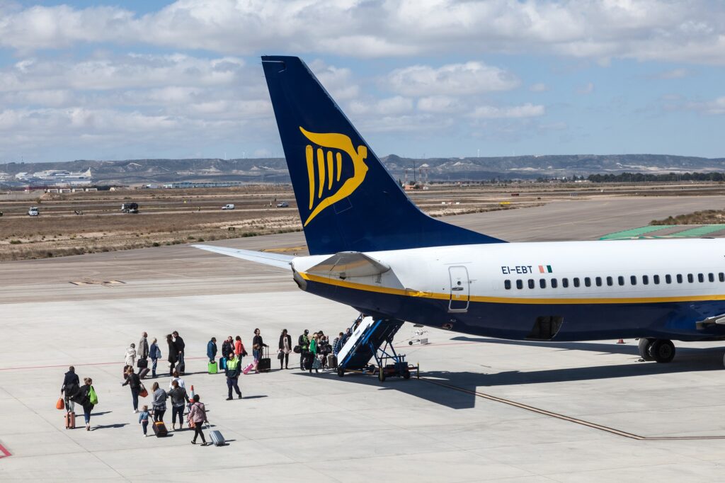
Ryanair launched in 1984 and has become one of the most successful airlines in the world.
The blue and yellow colors on its logo and the accompanying symbols mean the airline is instantly recognizable at airports.
But how many people would have actually noticed that the main yellow symbol on the logo is two separate images in one.
The first is of a harp, a historic symbol of Ireland and its culture, and the second is of a winged angel standing proudly while looking into the distance.
And one extra…
Fed-Ex
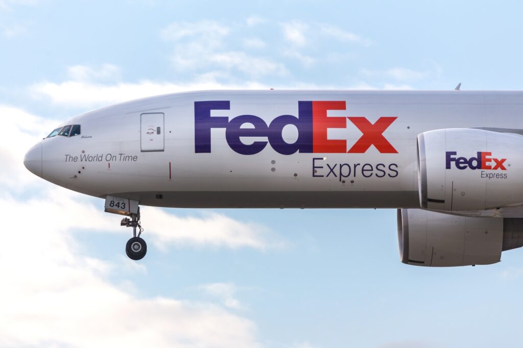
Although not strictly a commercial airline the Fed-Ex logo is considered one of the most accomplished of all time.
In the worldwide courier’s logo is a hidden white arrow pointing to the right which is formed in the space between the purple ‘E’ and ‘x’.
The ingenious design reflects the company’s values of speed and logistics.

