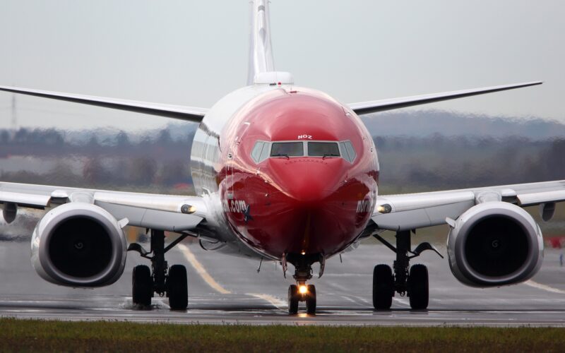
Oslo-based low-cost airline Norwegian has unveiled a new company logo as the carrier modernizes its visual profile.
The new Norwegian logo was introduced on February 28, 2024, across the airline’s social media channels as it aims to show more clearly the “company’s and brand’s personality and uniqueness”.
Norwegian’s social media profile pictures were also changed to the new design and an accompanying video announcing the news was also published.
“Is it a bird, is it a plane? Nope, it’s just our new logo,” the airline wrote on X (formally known as Twitter).
Is it a bird, is it a plane? Nope, it's just our new logo 💅🏼 pic.twitter.com/NdoG5FNi2f
— Norwegian (@Fly_Norwegian) February 28, 2024
The type face on the new logo remains similar to the previous one but feels much fresher and crisper against the famous red background.
The small aircraft symbol that was pictured sweeping underneath the lettering on the old logo now sits next to the airline name and the swoop behind the aircraft is smaller and forms part of the plane’s body.
The small profile picture used on social media now features the ‘N’ of Norwegian and the same plane symbol that is used next to lettering in the main logo.
Norwegian dévoile un nouveau chapitre visuel. Seul le rouge et blanc reste ,le logo se réinvente, et la typographie norvégienne évolue subtilement. ✨✈️ #Norwegian #IdentitéVisuelle #VoyageInnovant #logo pic.twitter.com/wVJaHy9jZi
— OHLALAIR (@ohlalair) February 28, 2024
“Norwegian’s logo and brand are very well known and appreciated, and we are very proud of that. Although we are now renewing ourselves, we promise that our customers will recognize us. After more than 20 years, a modernization is in order, and this gives Norwegian a more modern, warmer and clearer expression that will take us safely into the next 20 years,” Christoffer Sundby, Executive Vice President for Market and Customer Service at Norwegian, said.
The previous Norwegian logo was introduced in 2002 when the airline began operating as a low-cost carrier.
“Our new visual identity has a richer color palette, a new typographic expression and image style, and a more flexible layout system. We look forward to showing this off, both internally and externally. The rollout does not happen overnight. We will start in digital channels and will then update gradually and structured in all communication areas, offices, airports and on the planes themselves,” Camilla Aspen, Creative Director at Norwegian, said.
Other airlines that have recently launched new logos or branding include Air India, SAUDIA, and AJet (previously known as AnadoluJet).

